Flight 02 of 10Neptune’s Frozen Treats
Zero to launch brand development.
A premium ice cream shop focused on artisanal flavors and community gathering.
Overview
Building a complete brand system from zero
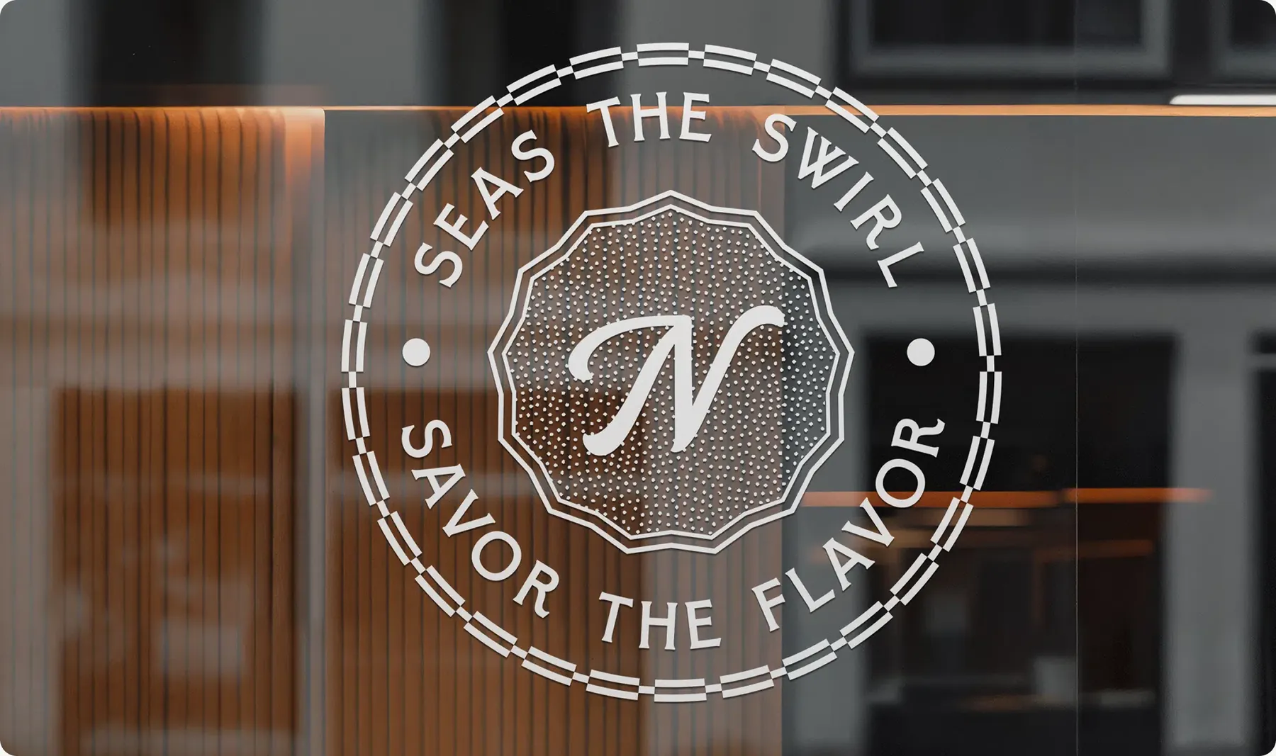
Neptune’s Frozen Treats was a new frozen dessert business entering a crowded local market with no existing brand equity. The challenge was not just to design a logo or website, but to build a cohesive brand system that could scale across digital, physical, and in shop experiences while clearly differentiating from competitors. This project covered the full lifecycle of a brand launch, from strategic positioning to execution across every customer touchpoint.
Challenge
Standing out in a market full of brands that look the same
The frozen dessert market is crowded with brands competing on price, novelty, or gimmicks. Neptune’s needed to stand out visually and emotionally, appeal to families, students, and casual walk in customers, and feel cohesive across storefront, packaging, merch, and digital, all while launching with a professional presence despite being a new business. The risk was fragmentation. Without a clear strategy, the brand could easily feel inconsistent or forgettable.
Project plan
Strategy before aesthetics
Before any design work began, we established clarity. We conducted competitive analysis of local and regional frozen treat brands, identified gaps in tone, visual identity, and the experience inside the shop, and defined brand positioning centered on approachability, consistency, and experience. We established brand pillars to guide all creative decisions and created a foundational brand framework to align design, messaging, and execution. This strategy ensured every design choice served a purpose rather than chasing trends.
Execution
Brand and experience design, start to finish
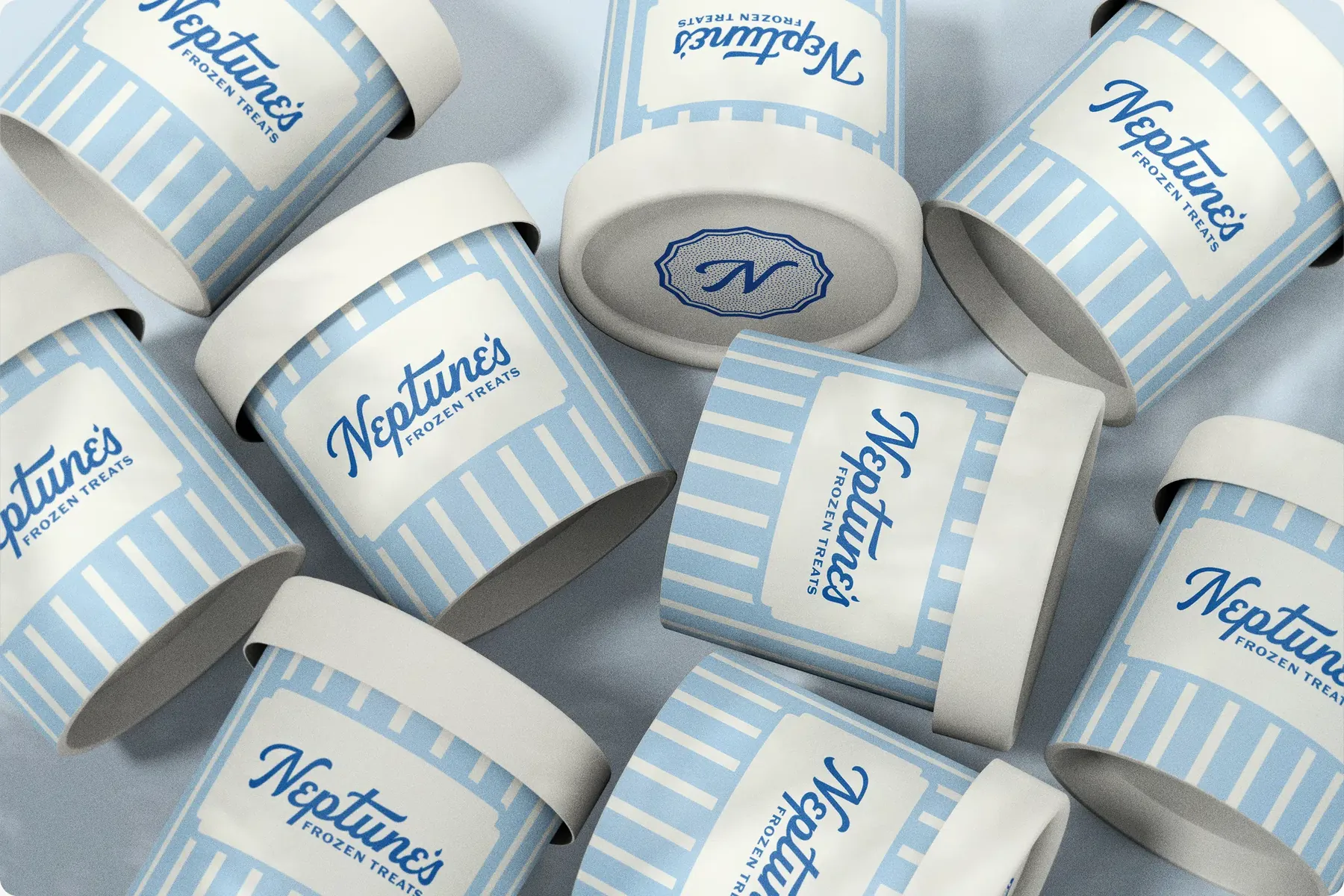
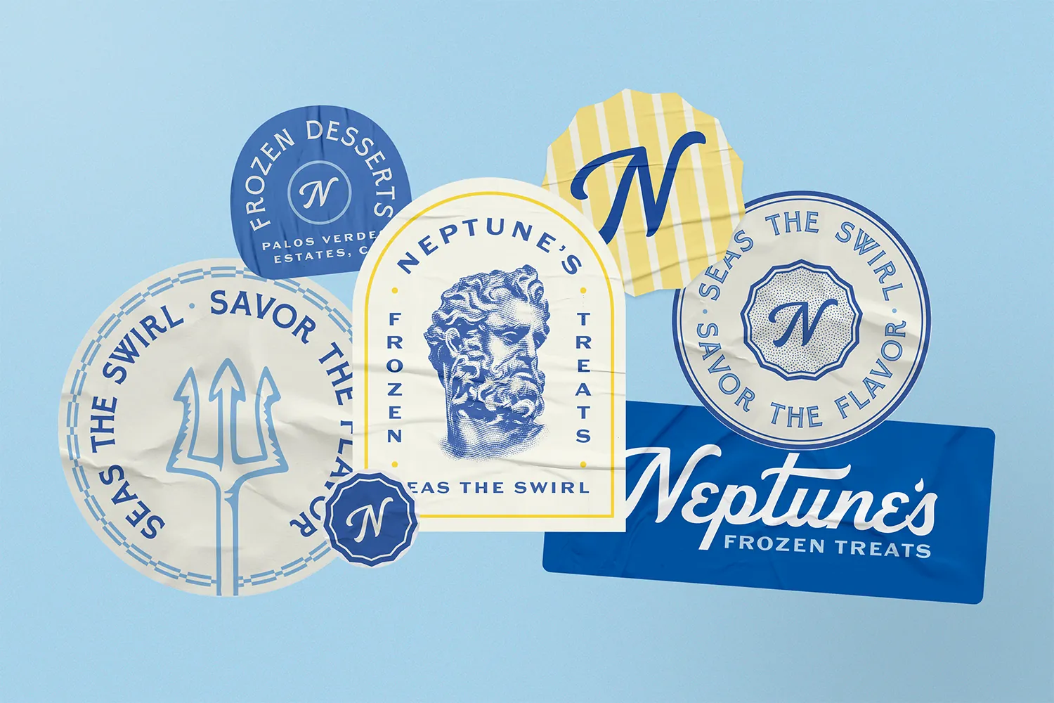
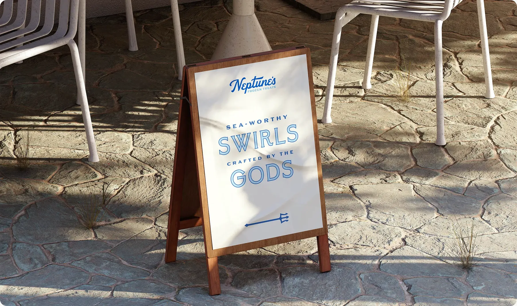
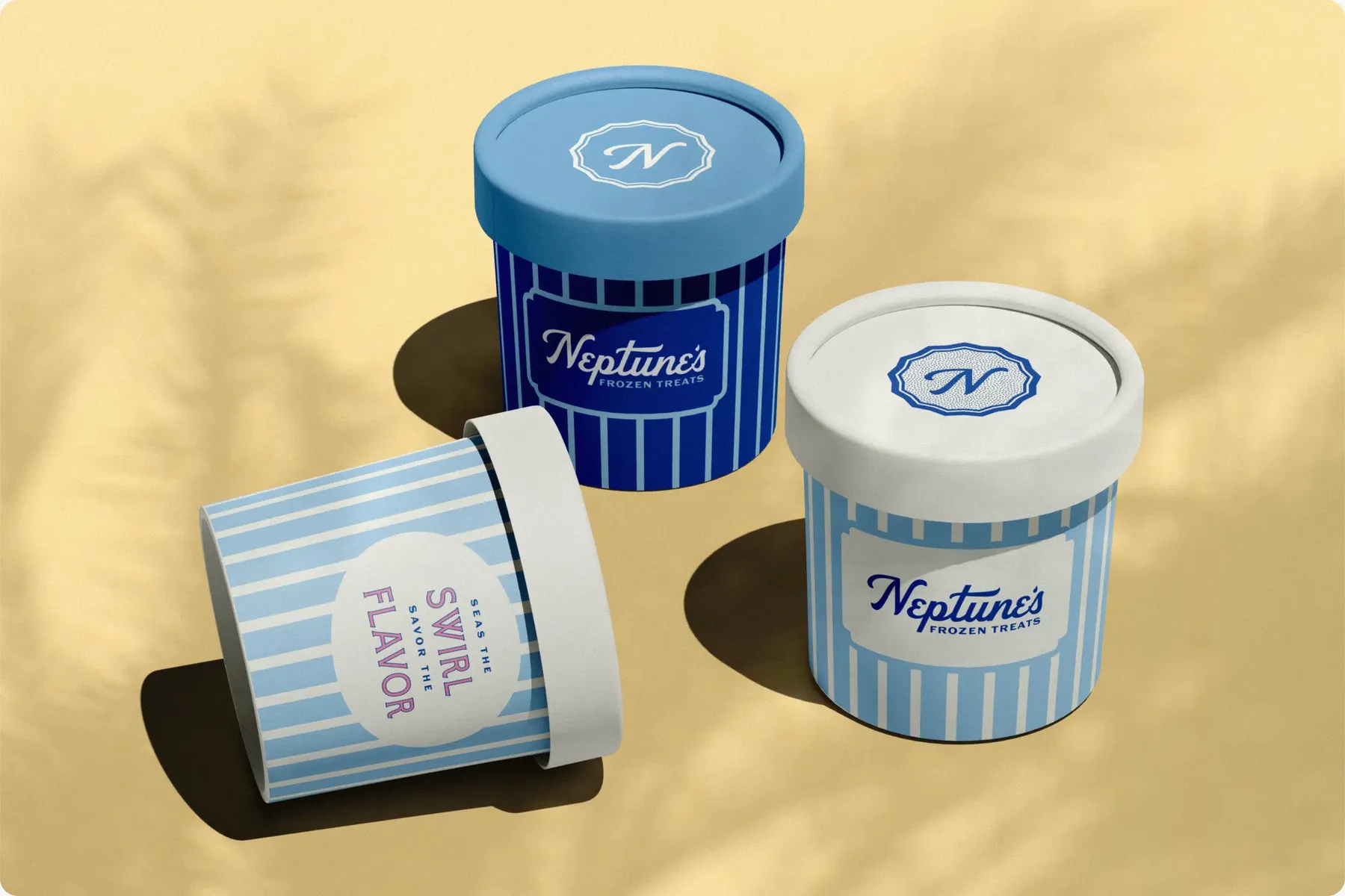
With strategy locked, execution spanned every customer interaction. We designed a full website experience focused on clarity and visual consistency, established social media branding templates, and created merchandise including shirts and hats. We developed packaging designs, signage systems for exterior visibility and interior flow, interior branding elements, and uniform designs. Using Adobe Creative Suite and Figma, we ensured color, typography, and visual language remained consistent across digital, physical, and experiential touchpoints.
Results
A brand that felt established from day one
Neptune’s launched with a fully realized brand system spanning digital, physical, and experiential touchpoints. The result was a cohesive customer experience from first impression to the moment customers walked in, a scalable brand foundation built to grow with the business, and an identity that felt established despite being a new entrant. Most importantly, Neptune’s launched with clarity and confidence, not as “just another frozen treat shop,” but as a recognizable, intentional brand.